
Installing Tailwind CSS
Tailwind is a popular library for styling components in React. The styling is written directly in React components, using hundreds of small "utility" CSS classes. Only those classes actually used in the code will be included in the final app code, keeping download sizes small.
To install the Tailwind CSS library into a Vite React project,
npm install tailwindcss @tailwindcss/viteAdd the Tailwind plugin to the file vite.config.js. Wite will call the plugin to process Tailwind CSS every time you rebuild the app.
import { defineConfig } from 'vite'
import react from '@vitejs/plugin-react'
!!import tailwindcss from '@tailwindcss/vite'

// https://vite.dev/config/
export default defineConfig({
  plugins: [
!!    tailwindcss(),
    react()],
})
Replace the default contents of src/index.css with this one line:
@import "tailwindcss";Delete the default contents of src/App.css.
Notes
Tailwind CSS v4 was released in January 2025. This made major changes to how Tailwind is installed and configured. Many online pages are out of date. Ignore any references to postcss or tailwind.config.js.
The Vite plugin takes care of calling the Tailwind process to collect the Tailwind classes used, even creating some on the fly, so that only the necessary CSS classes will be included in the resulting production build.
Links
- Current Tailwind documentation on installing with Vite
- the Tailwind Playground -- Use this to experiment with Tailwind options. Remember to use class in the Playground but className in React.
Styling a button
In Tailwind, you don't get a library of components, such as Button and Table that combine various CSS choices together, as you do in Bootstrap and Material UI. Nor do you write CSS code directly, as you do with styled components. Instead, you combine hundreds of small classes for padding, margins, colors, layout, and so on, as needed to style an element, like this

interface ButtonProps {
  text: string;
  onClick: () => void;
}

export const Button = ({ text, onClick }: ButtonProps) => (
  <button className="bg-blue-500 hover:bg-blue-700 text-white font-bold py-2 px-4 rounded"
          onClick={onClick}>
    {text}
  </button>
);
Notes
Note that there is no use of the style attribute. Everything is done through CSS classes. Because every Tailwind class does just one small thing, it's common to have many classes specified for a component.
No import is needed in Button.tsx
to get the Tailwind classes.
Code that uses CSS libraries like Bootstrap or Material UI will import
styled components, like
Remember that CSS styles and classes can only be attached to HTML elements, such as div and table. You can't attach them to React components such as UserCard, because it would unclear where the CSS should be placed in the rendered HTML.
p-number and m-number are Tailwind classes for padding and margin respectively. The spacing generated is number times 0.25rem, so m-4 is a margin of 1rem. This class naming syntax is used in all Tailwind classes that involve height or width.
Similarly, bg-blue-[number] is the syntax for specifying a shade of blue to use as a background color.
rounded is a nice short way to get rounded borders. text-white and font-bold are pretty clear.
hover: and other forms using a colon are used to specify styles using CSS pseudo-classes, i.e., styles that only apply when an HTML is in a particular state, such as underneath the mouse cursor.
Links
- Styling with utility classes
- Color values in Tailwind -- defines the numbering scheme for color shades
- Rounded borders
- Text coloring
- Font weight
- Hover, focus, and other states
- Tailwind CSS Tutorial - Learn Tailwind CSS Concepts With Examples
Styling a table
It can become tedious to copy and paste the same style on to every cell in a table. In pure CSS, this is handled by using selectors such as table.special tr td { ... } to apply a style to every td in a table with the class special. Tailwind doesn't do global styling, but it does have a way to apply the same style to every immediate child of an element.
Here is an example of a table of user data styled with Tailwind CSS.
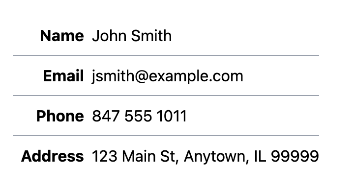
const UserCard = ({ user }: UserCardProps ) => (
  <table className="border border-gray-400 m-4">
    <tbody>
      <tr className="*:border *:border-gray-300 *:p-2">
        <th>Name</td>
        <td>{ user.name }</td>
      </tr>
      <tr className="*:border *:border-gray-300 *:p-2">
        <th>Email</td>
        <td>{ user.email }</td>
      </tr>
      <tr className="*:border *:border-gray-300 *:p-2">
        <th>Phone</td>
        <td>{ user.phone }</td>
      </tr>
      <tr className="*:border *:border-gray-300 *:p-2">
        <th>Address</td>
        <td>{ user.address }</td>
      </tr>
    </tbody>
  </table>
);
Notes
*:class applies the Tailwind class to the direct children of an element. This can reduce clutter in repetitive structures like tables.
Links
Defining a card component
Cards -- bordered boxes with content -- are a popular format for displaying multiple pieces of similar content.
Here is a simple card with an image, text, and a button at the bottom, using Tailwind.
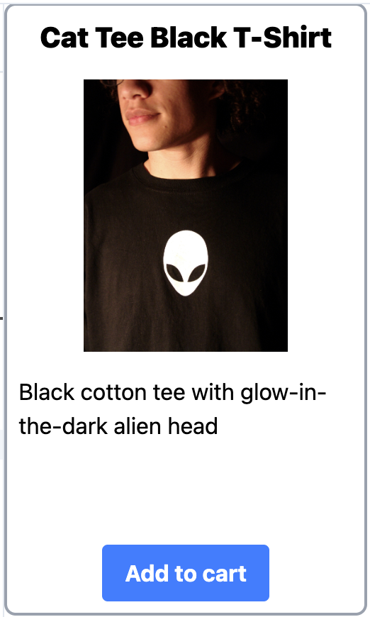
const ProductCard = ({ product }: ProductCardProps) => (
  <div className="flex flex-col items-center h-108 w-64 p-2 border-2 border-gray-400 rounded-lg">
    <div className="font-black text-xl">
      { product.name }
    </div>
    <img className="h-48 w-48 my-4 object-contain"
         src={ product.imageUrl }>
    <div className="flex-grow">
      { product.description}
    </div>
    <button className="bg-blue-500 hover:bg-blue-700 text-white font-bold py-2 px-4 rounded">
      Add to cart
   </button>
  </div>
);
Notes
The flex-col puts the card elements in a vertical stack. The flex-grow on the second-last element -- the product description -- causes that element to stretch vertically to fill any available column space. This leads to the Add to cart button moving to the bottom of every card.
The object-contain on the img resizes any image to fit the given dimensions in each card.
Links
Defining a grid of cards
A common problem is to display an unknown number of items in a regular rectangular array is grid, where the number of items is responsive to the screen width. The Tailwind to do this, and the CSS beneath it, is a bit cryptic, but not hard to adapt to different item sizes.

import Product from './Product';
import './Products.css'

const ProductList = ({products}) => (
!!  <div className="grid grid-cols-[repeat(auto-fill,_minmax(200px,_1fr))] gap-4 px-4">
    {
      products.map(product => <Product key={product.id} product={product} />)
    }
  </div>
);

export default ProductList;
Notes
The grid-cols-[...] syntax inserts the custom CSS expression between the square brackets into a CSS grid-template-columns style declaration. These expressions are non-trivial but powerful enough to do looping. The one here says to repeatedly add items using a CSS minmax expression to control the minumum and maximum size.
Spaces are not allowed in CSS classnames, including in expressions intended for custom styles. Either omit spaces or use underscores instead.
Links
- Grid template columns
- Responsive Tailwind CSS Grid with Auto-Fit and Auto-Fill -- the source of the above Tailwind code
- Handling whitespace in CSS classes
- Untitled UI React -- large open-source library of components styled with Tailwind to copy and paste